As if SEO wasn’t already complicated and time consuming enough, Google has changed the rules of the game once again. Googlebots are crawling your website a little differently now, and it’s important to understand how this can and will affect the SEO ranking of your website. Ever since “Mobilegeddon” in 2015, there has been a significant shift of focus on how important mobile-friendly websites are to SERP rankings. It only makes sense that there would be another change and people are actually wondering what took so long.
What Is Mobile-First Indexing?
The term simply refers to the way that Google is now crawling websites to determine where to rank them in the search engine results pages (SERP). Instead of crawling your site as a desktop user, Googlebots are now simulating mobile user experiences. According to a November 2016 article in TechCrunch, “combined traffic from mobile devices, which includes mobile and tablet devices, surpassed traffic from desktop devices for the first time by 2.5%.”
With the mobile traffic shift, it makes sense that Google would change the way it measures the relevance of your site. In fact, according to Search Engine Land, Google confirmed mobile searches had surpassed desktop searches back in May of 2015, so the switch from desktop to mobile indexing appears to be long overdue.
History of Mobile-First Indexing
The Google Webmaster Central Blog first announced the testing of mobile-first indexing on November 4, 2016. They stated the reasoning behind the change is that it further improves upon their mission to continually deliver the most relevant search results to users.
Although it’s technically live, it still has a way to go. If you’re in the process of designing a new website or redesigning an existing website, it’s an important factor to consider. Even if you weren’t considering a web redesign, if your current site isn’t responsive or mobile-friendly, it may be time to make some critical updates in order to improve the user experience for your viewers, and for Google.
THE IMPACT
While it’s still only one factor that goes into how Google ranks your website, it’s a highly significant one. Other major SEO factors, such as having properly working links and short page loading times, are directly correlated with how mobile-friendly or responsive your website is. If your website was originally built for a desktop user, and was later modified to meet the needs of mobile users, a mobile visitor (or Googlebot) may experience slower load times and arrive at broken links. It’s easy to see how this would negatively affect your site rank.
Whether your website is mobile friendly/responsive or not, it still can be indexed at this time. Though Google’s mobile-first indexing is still in its beginning stages of implementation, it’s likely that it will continue to have more of an effect on website rankings. If you don’t make the switch, there is a high possibility that you could see a decrease in your site rank sooner than later.
KNOWING WHERE YOUr WEBSITE STANDS
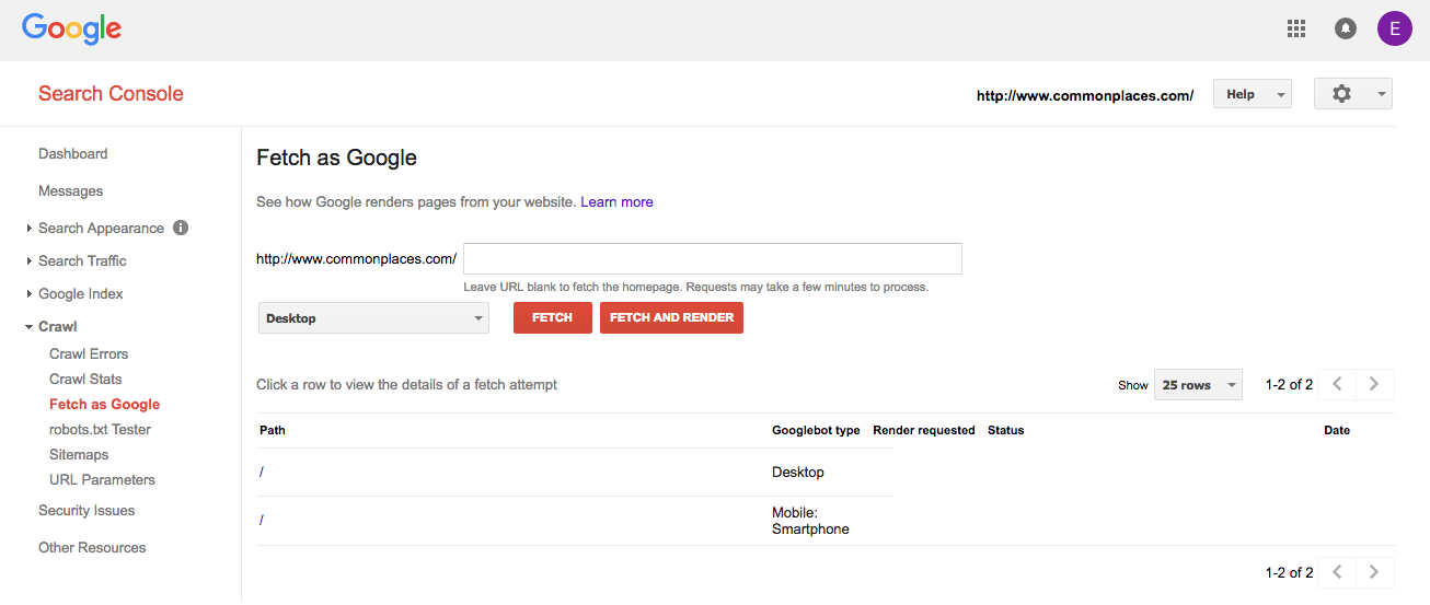
If you aren’t sure how your current website is seen by Googlebots, you can actually get a glimpse by using the Google Search Console. Simply click on the “crawl” button, located on the left-hand side bar, and choose the option, “Fetch as Google.” To view your site as a mobile user, simply click on “mobile smartphone”, and then, “Fetch and Render.”

After you’ve gotten a chance to see your site from Google’s perspective, it may be time to make some changes. Take a look at the content, and determine if the desktop and mobile content is the same. If it isn’t, you may have a problem. You’ll also want to ensure that your site speed is acceptable. You can run a page speed test on each page of your site to check for any load time issues.
Take a look at your keyword strategy, and make sure that you’re optimizing for mobile keywords and desktop keywords. There is actually a significant difference and will affect how easily mobile users find your site.
Don’t forget to update your company information on local listing sites, such as Google My Business, Yelp, and other local review sites. According to Think with Google, “50% of consumers who conduct a local search on their smartphone visit a store within a day, and 18% of those searches lead to a purchase within a day.” Ensuring that your company information is complete, accurate and consistant is becoming increasingly important for mobile success. Unsure if your company NAP (name, address, phone) is being displayed correctly across local review sites? Request a free local listings scan from us!
Mobile-First indexing is here. Is your website ready?


