The new year brings a wealth of simplicity to the web with new trends appearing in the spotlight for online branding and functionality. As a society, we have begun to adapt daily life to the tried and true “less is more” marketing strategy of successful big-name advertisers. This effortlessly helps keep consumers’ attention focused on the message at hand. The bold and simple strategy we have been seeing is a great example of what to consider when building or refreshing your web presence for the new year. In this article, we will touch on some key points and modern trends to keep in mind when planning your website, now and for the future.
The Trend of the One-Page Website
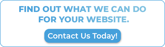
Like a movie poster you see at the cinema, the goal of a one-page website is to give your customers the gist of how your company can benefit their interests by delivering a bold message and immediate call to action. By having a strong one-liner combined with a simple image that includes everything the user needs to know at a glance, and above the fold, you will attract conversions. Let’s take a look at sites like Tesla or NURX, for example. These boast a beautifully simple homepage design with a call to action immediately visible and ready to click or tap.
Now, one-page might be a bit of a misnomer since there are often simple menus available leading to additional pages, but the most powerful lead capture tool is found right on the homepage. The Call to Action. Like this:
Responsive Navigation for Various Devices
You probably already know this one, but responsive navigation menus are a must for websites in this day and age since over 50% of users will be viewing on a mobile device. So, while there might be a few trends of flashy navigation on the desktop site to get attention and tell users what to do – always keep the mobile site design navigation in mind.
Always Remember Mobile First: Make sure that your design is tap-friendly and swipe-scrollable. Take a gander at this article to learn more about mobile first design.

Businesses and websites should follow accessibility guidelines.
All users should be able to have a similar experience regardless of whether they have a disability or not. Websites should have functionality that is seamless in terms of user experience and design. WCAG 2.1 guidelines are a great resource to understand how to make your site accessible to all.
Integration with Social Media
Social media is where many people primarily get their news. It plays an integral role in your online persona and helps you connect with your target audience in ways that would be otherwise unreachable. Consumers have now been conditioned to look for a brand’s social media buttons in a prominent position on their website. So, while it has been common in the past to place social media buttons in the footer section of a company website – kind of like an afterthought – with the effectiveness of these social platforms, it is certainly good to consider prominence.
Clean Web Visuals Only. No Clutter Allowed.
While visuals are an important part of the online user experience, a limited quantity of images should be used on websites to optimize speed and efficiency. Using image formats like .svg and .webp will allow for minimal data processing and keep your site running on the quick. Web designers may consider focusing on unique typography styles, bold fonts by Google Fonts (Recommended) or Adobe Typekit – which will have the least chance of transforming on different browsers, simple illustrated vector elements, and strong but unified color palettes.
Simplified Motion Design to Catch the Eye
The slightest bit of movement will catch the eye and create a living experience. Simplistic effects like mouse-triggered scaling or a minimal parallax scroll can add visual interest without hanging up your page load speed so long as you keep the motion to a bare but attractive minimum.
Geometry is back, and more classy than ever.
When creatively used, shapes and lines give a modern look to a design. While these once fell to the wayside, they are back with subtle but effective flair that captures motion and presents visual interest. Re-enter the gradient. For a while, big brands began simplifying their looks and logos to a flat and simple design. Where we used to see bevels and shadows, which are still very retro, gradients are being used to very subtly enhance the look of such flat logos, buttons, headers, and branding elements.
People talk to their devices more than ever. Make your website talk back.
What? Voice User Interface, aka VUI is a modern SEO content trend that you should follow in the years to come. People are increasingly utilizing voice search features that Google and Siri offer, and your written content should be optimized to answer commonly spoken questions that pertain to your audience. Your SERP will thank you. Some good examples of what you can add to your site to make use of this technology are:
- A robust FAQ section that answers customer questions in real everyday language about your business or industry
- A ‘resources’ section that provides information in the form of keyword-rich (but NOT keyword stuffed!) snippets that link to downloadable content like whitepapers or how-to-guides
- A dedicated ‘services’ section that is well thought out – to grab both your readers’ and Google’s attention
- And quite importantly, a good use of your H1 H2 etc… header tags to show the Googs what’s important.Now, if you find that you’ve gone down a rabbit hole by way of adding loads and loads of content because you have SO many useful resources, you might even consider a customer experience portal to house it all.
Chat Bots are a good way to engage, but keep them un-invasive.
Chat bots are becoming more and more prevalent in a world where people want answers NOW. By using these as part of your website, you can provide answers to your frequently asked questions while still giving a (mostly) human voice. Just be sure one isn’t popping up on every page visited.
New Year New You #WebsiteGoals
The new year is always a good time to make that resolution to improve your website, and by keeping these strategies in mind for simplicity, user experience ease, and bold brand messaging, you will be able to keep up with the expectations of your consumers as well as satisfy search engine guidelines for maximum visibility and conversions.
Ready to start off the year on the path to success and keep going strong for the future? CommonPlaces is ready to lend a hand, so give us a shout today.


