When it comes to web design, just as with any other form of design, staying with the current trends can be important. It’s not even a matter of staying ‘hip’ or ‘in the now’ or whatever people want to call it anymore, but often times there are legitimate reasons for trends to change so drastically.
Take a look at the computer you’re on right now. Just think: there’s a good chance it can fit in a bag, whether it’s a laptop, tablet, or even phone. This is a perfect example of how technology has changed over the past few years, making accessing the internet even easier than ever. Usability is a huge factor in what’s coming next, whether it is the physical computer you’re using, the browser you’re accessing the internet with, or the website that you’re currently reading a blog on.
Design You Can Almost Feel
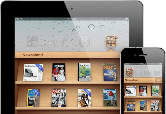
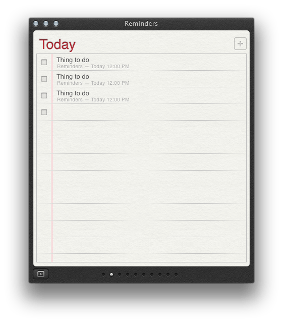
Before Flat Design became popular, a style called Skeuomorphism had taken over many well-known websites and apps. The overall idea was to make digital tools look like their ‘Öreal world’ physical counterparts. Apple had many perfect examples of this in iOS5 and 6, including their Newsstand app, and even their current Reminders app.
Why use Flat Design instead?
There has been a lot of controversy about skeuomorphism, but what a lot of it has come down to is overcomplicating designs and, as with any trend, overuse. The idea of Flat Design came from focusing more on usability, and less on familiarity. The philosophy is that our minds don’t need complex visual cues to understand what we are looking at. We are perfectly capable of recognizing shapes and giving them meaning with minimal cues.
By minimizing design, we are removing unnecessary distractions that otherwise have no definitive purpose, and may only distract us from the purpose of the application. Plus, with responsive design becoming so important, flat design makes it much easier to adjust to multiple screen sizes without the extra unnecessary graphics.
One of the first big uses of Flat Design was brought to us by Google. With Google Now, information is presented to us in a very clean and usable way using simple icons and clean, very readable text.
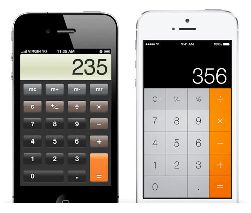
Apple also changed to a more flat approach with their redesigned iOS7, including previously skeuomorphic apps such as the Calculator app.

-
Bright, but muted colors
-
Minimalistic icons
-
Definitive geometric shapes
-
Focus on simple imagery, and less on bodies of text
Bright colors are generally used because they make it easy to distinguish sections and make icons easy to understand, while being a very simple way of adding hierarchy. Having high contrast makes it much easier to create minimalistic icons with shapes that are easily recognized, even though they are far from realistic.
A perfect example of this would be street signs or crosswalk signals. Next time you see a crosswalk sign, notice how the people represented in the sign are far from anatomically correct, yet we still perceive them as people. Icons like this are used because it is much easier and quicker to recognize a symbol than read words describing what the symbol means.
A Few Examples

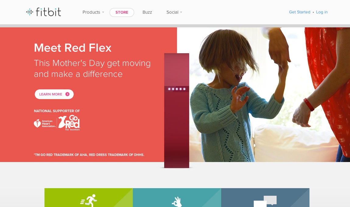

Do you use flat design? Share examples with us!

